News
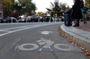
Cambridge Residents Slam Council Proposal to Delay Bike Lane Construction

News
‘Gender-Affirming Slay Fest’: Harvard College QSA Hosts Annual Queer Prom
News
‘Not Being Nerds’: Harvard Students Dance to Tinashe at Yardfest

News
Wrongful Death Trial Against CAMHS Employee Over 2015 Student Suicide To Begin Tuesday

News
Cornel West, Harvard Affiliates Call for University to Divest from ‘Israeli Apartheid’ at Rally
An Exhibition of a Different Type
About Faces: Historic and Dentemporary Leasing In Type Design at the Houghton Library through February 18
When Ross Perot began his presidential campaign last year, he promised to use technology as an engine of radical democratization. The citizens of the Texas billionane's cybersepublic Would communicate their opinions to the president via PC and modem. The case with which bailots could be case and counted would render representative government in its present form obsolute and the Washington power slite would wither perot's plan would transform the landscape of American politics.
The Houghton Libray's current exhibit, "About Faces: Historic and contemporary Issue in Type Design," suggests that such computer-driven democracy movement have already occurred outside the political sphere. If he cared about likely approve of the similar convulsions that technology has produced within the world of type design. The well chosen pieces in the exhibit convey the sense that the typographic snob-club that has determined letterom fashion since Gutenberg now teeters on the verge of collapse
Typography began as an art understood and practiced by only a few people, but the first type designers worked under standards less conservative than their 18th- and 19th century successors, Gutenberg based his early type (not included in this exhibit) on the black-letter style used by German scribes (see the banner of The Boston Globe and The New York Times). Others experimented with types that looked like the monk with quill calligraphy to which literate people were accustomed. Such types become known as italics. Still others imitated everyday handwriting, and a fourth group copied the sturdy, draftsmanlike formality of the letterforms from Roman columns
"About faces" contains samples of the italic, roman and handwriting-based types although the non-chronological arrangement of the pieces somewhat obscures the history. A 1526 book on display contains text set in a font Ludovico degli Arrighi designed after his own handwriting, and the French designer Robert Granjon used a hand-based script-complete with overstated ascenders and descenders and exggerated capital-in a 1558 publication.
The exhibit gives evidence of the gradual idealization of the printed, rather than the handwriting, letterform. One 1570 piece exemplifies the increasing dominance of the roman types, Giovan france Cresci, a calligrapher, tried to invigorate his own fading business by putting together a book whose lettering suggested that hand should imitate machine.
Cresci's dilemma suggests a trend, by the 1700s type designers were spending most of their efforts on refining roman letterforms and adapting them to new papers, inks and presses. A Perotist critique of the period would identify a small group of type designers--a power elite --who created a letter-form gridlock. some change occurred in the late 19th and early 20th centuries. Newspapers demanded coarse new faces suitable for use in poor printing conditions, Mergenthaler "Corons" resulted from such demands. And while new type-faces once took years to develop, photographic type equipment made reasonable some corporation requests for customized fonts Still, most power over typography remained in the bands of a small clique of specialists.
Enter competition in recent years mouse wielding of Macintosh users have become accustomed to making daily choices among typefaces. Do-it-yourself desktop publication of resumes, business cards, newsletters, and reports prevents trained specialties from exercising any control over the look of many typeset document.
As a consequence of letterform democracy typography now tilts in a direction that conservative designers of the last century would abhor. Faddish fonts dominate the media for a few months, than grow obsolete. Last year you could find Adobe's "Lithos," "Industria," and "Insignia splashed across potato chip bags, MTV, HBO, and the ads in this newspaper. It becomes possible to date to document by the type it contains. "windsor? So woody Allen, so '87. Copper plate?. Already retro by the summer of 1992. "Arcadia?". Late November 1991. "About Faces" contain non of these now-you-see me-now-you -don't types.
On the other hand, sometimes newly empowered amateur typographers make "uneducated choices" and stick to them. The now-ubiquitous "Times Roman," originally designed for a London newspaper. Replaces such older faces as"Bodoni," "Bembo," and "Baskeryille." The people wield power in the new technology-driven typography, but most people are simultaneously intrigued by novelties and resistant to change.
This appears contradictions suggests that a wide variety of typefaces may be commercially viable. And the contradiction, when combined with technology, gives type designers room to maneuver. According to the exhibit notes, producing a new typeface once took years or decades. But the advent of digital type--often conceived, drawn, and edited entirely on screen--shortens the production time to hours, days, or weeks. Former Adams House resident Matthew Butterick '92 even created commercial types while still a full-time student. The demand for a diversity of typefaces pushes typography toward eclecticism.
Consequently, Adobe sells many copies of Robert Slimbach's recent "Minion" (the face in which this text is set), a neo-classical type to the mass market, but alternative type foundries such as Emigre and fontshop International survive as well. Experimental typographers, having given up on the traditional, roman letterform, base new on photographs and Dizzy Gillespie's handwriting. The 1980s and '90s have produced a dazzling number of new types.
We may never know how perot's "electronic town halls" would have changed politics, but the Houghton exhibit indicates that digital democracy has served typography well. Such exhibits as "About face" can ensure that consumers and designers use democracy's energies properly, constumers will learn that the history of type began long before Apple began bundling bitmaps of "Times," "Helvetica" and "Palatine" with Macintosh will be able contract the wild modern early periods with the stodgy lay in between.
The well-chosen pieces in "About Faces" suggest that the typographic snob-club now tetters on the verge of collapse.
Want to keep up with breaking news? Subscribe to our email newsletter.