News
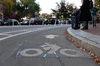
Cambridge Residents Slam Council Proposal to Delay Bike Lane Construction

News
‘Gender-Affirming Slay Fest’: Harvard College QSA Hosts Annual Queer Prom
News
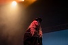
‘Not Being Nerds’: Harvard Students Dance to Tinashe at Yardfest

News
Wrongful Death Trial Against CAMHS Employee Over 2015 Student Suicide To Begin Tuesday

News
Cornel West, Harvard Affiliates Call for University to Divest from ‘Israeli Apartheid’ at Rally
How Technology Can Increase Media Transparency
A few weeks ago, a chart by Fox News titled “Unemployment Rate Under Obama” appeared on my Facebook newsfeed. It consisted of a line graph intersecting a dozen or so data points, each representing the unemployment rate for a given month. It showed what appeared to be a plateau in unemployment in recent months.
At first glance, the chart seemed utterly unremarkable: each axis is labeled, there is a title, a source is credited, and each axis does not appear immediately misleading. Upon closer examination, however, you’ll notice that the 8.6 percent unemployment rate cited by the Bureau of Labor Statistics in November is actually above the 9 percent axis gridline. Although the numbers clearly suggest that the unemployment rate has decreased from 9 percent to 8.6 percent, the trend line shows no change.
I don’t want to target Fox News as the sole perpetrator of misinformation. To be fair, left-leaning news sources have published misleading or inaccurate charts, and it’s unclear whether such inaccuracies are accidental or deliberate. Yet the question of bias in the news media is a larger issue; right now my concern is with the way popular media sources present data.
In 2010, I wrote an article that called for new standards for defining news versus opinion programming. In that piece, I highlighted the dangers of the public misunderstanding news from opinion, and offered a potential solution: new standards, much like television ratings, that are displayed at the beginning of a program to highlight whether that particular programming is news or opinion programming. Those standards, I argued, should be determined by an unbiased third party, and continually revised if deemed appropriate.
The Fox News chart I described above, however, got me thinking. Is there any way we can make the manner in which televisions programs display their data more transparent?
We could, for example, require that a broadcast actually show a source’s data rather than just displaying a citation. For example, should a broadcast display a chart based on a source’s data, they would also display the chart used in the source document (or, if a chart is not used, a table of the source’s data). This way, broadcasts can avoid instances such as the one above. With such changes as this, viewers would clearly see that a source’s chart would look different than the one provided by the news source. Sure, there would be many more redundant charts broadcast on news programming, but I suspect that many “simple” errors would be eliminated this way.
A more interesting and advanced way to improve the reliability of data on news programs involves the use of smartphone technology and audio tagging apps such as Shazam. Shazam identifies songs based on a few seconds of audio input. Now that there are more there are more American adults who use smartphones than more basic “feature” phones, broadcasts could incorporate Shazam technology whenever they present data from a source. Viewers could audio tag that data through their Shazam app, taking the viewer directly to the source information that was used in the broadcast or related links based on the source information. Thus, viewers would have nearly instantaneous access to the source information right on their smartphones (or tablets, etc.), and can make their own decision as to whether the data was used accurately. Yes, this would require viewers to be more proactive, but it is an innovative way to improve media transparency radically.
While these solutions do not get to the root problem of media bias, they are positive steps toward a more transparent set of guidelines for data usage. At a minimum, these solutions encourage a broader public debate on media transparency and how we can encourage more accurate use of data in broadcast programming. In their most powerful form however, these solutions represent the first steps towards a more factually accurate and transparent media industry that engages its viewers in a meaningful way.
Rexhep Dollaku ’13, a Crimson editorial writer, is an economics concentrator in Quincy House.
Want to keep up with breaking news? Subscribe to our email newsletter.