
News
Pro-Palestine Encampment Represents First Major Test for Harvard President Alan Garber

News
Israeli PM Benjamin Netanyahu Condemns Antisemitism at U.S. Colleges Amid Encampment at Harvard

News
‘A Joke’: Nikole Hannah-Jones Says Harvard Should Spend More on Legacy of Slavery Initiative

News
Massachusetts ACLU Demands Harvard Reinstate PSC in Letter

News
LIVE UPDATES: Pro-Palestine Protesters Begin Encampment in Harvard Yard
Art For Sale
Can designing the interiors of stores and displays be considered an art?
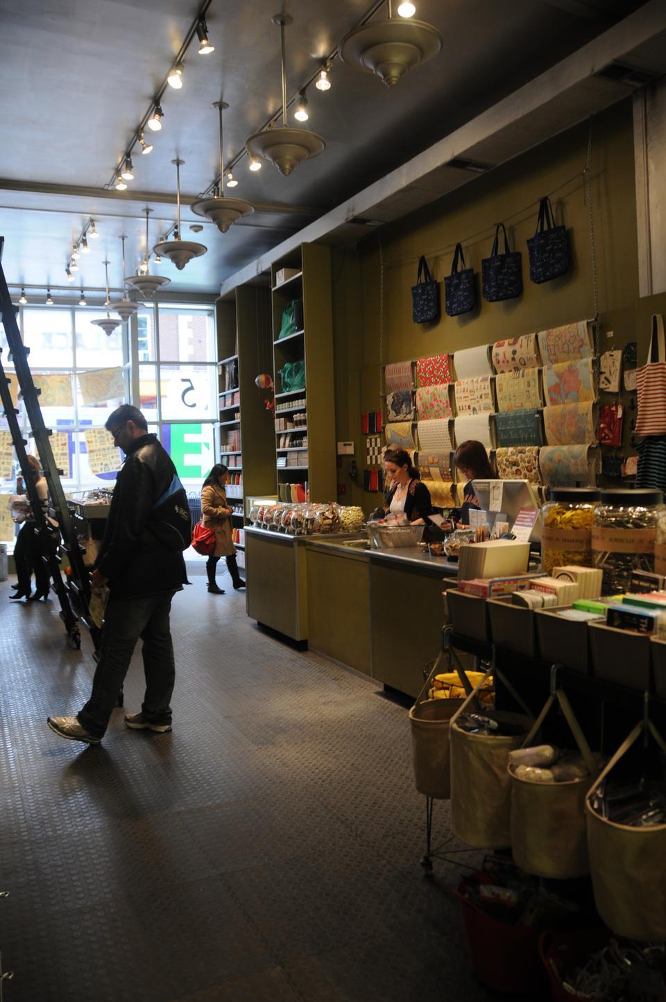
Harvard Square’s Black Ink is a store that can turn 20 feet into half an hour. What looks like a wall of shelves can turn into an afternoon of shopping, since it takes an unexpectedly long time to explore this compact space. Stepping in feels less like entering a store than a modern-day cabinet of curiosities. Glass bowls brim with tops, elastics, and oversized paper clips. Cubic shelves vault 11 feet to the ceiling and are replete with colorful tea sets, posters, and matchbook gardens.
It’s not just the quirky and beautiful products that attract people, but the store’s design. The towering shelves order the chaos and feel limitless. It’s an experience more akin to entering a museum than shopping, and Black Ink isn’t alone. The arrangement and design of shops throughout Cambridge and Boston often look more like products of curation than merchandising—schemes that result from personal, aesthetic choices from the owners that often happen to appeal to a variety of buying customers.
But can the practice of curating, an art in its own right, be applied to pushing product? Even though it serves a definite commercial end, the idea of “curating” a store may not necessarily be dismissed as just marketing, without art or design. Maybe it’s a form of art that brings beauty into the everyday.
CREATURE COMFORTS
As snow accumulates rapidly and melts on my glasses, I finally spot Bobby from Boston, a vintage menswear store. Tucked away among several galleries and cafes, it rests on the gentrified edge of the South End. I quickly turn up a narrow cobblestone alley and duck into the shop for refuge from the snow.
The store is warm and inviting, like an old library. Dark, weathered wood lines the store, and hanging, glowing orbs shed a soft, incandescent light. Owner Bobby Garnett has just gone out for a cigarette, but I don’t mind. As a keen thrift-shopper, I look through the dark, clean shelves of pants, jackets, and boots. The experience is worlds away from thrifting. It’s sometimes difficult to believe that the apparel is used.
Bobby from Boston was founded in 1992, but Bobby’s been in the business for more than 40 years. His first shop opened in ’71—a leather shop, totally different from the one I’m sitting in now. “The other shops I had were more of an Art Deco, chrome and glass feel.” Sounds keen.
But the decor of Bobby from Boston is a long way from Art Deco. “We try to have the feeling of [a store of the era]… anywhere between the 1800s to the 1930s,” he says. He was first inspired by a vintage store in Philadelphia—a small place called “Rosebud.” It was the first vintage store’s interior that he really liked.
But he doesn’t want the aesthetic to get in the way of comfort. It’s that comfort he found in English menswear shops—an aesthetic based on both style and function—which inspired him for this store. “I think it’s important, especially if you’re selling a used item, to make it comfortable to try it on, to look at it, make it easy by having everything organized,” he says. “People come in here, and…they don’t feel like they’re coming into a thrift store where it’s just racks and racks and racks of clothing; the whole place is very curated, you know?”
“Curated”—who would deny it?
TOP-DOWN ERGONOMICS
“Our inspiration comes from [our] home office, which is in Philadelphia,” says Katrine B. Hildebrandt-Hussey, a senior display coordinator at Anthropologie. A visual manager at Anthropologie is responsible for merchandising and overseeing displays. “My job is to conceptualize and execute those displays,” she says. Despite the “senior” in her title, Hildebrandt-Hussey has been at Anthropologie for less than three years. She received her Bachelor of Arts from Hartwick College and got a Masters in sculpting from Massachusetts College of Art and Design.
How do so many individual branches receive inspiration from a single office? We’re sitting on a leather couch in what appears to be a small living room on the top floor of the Harvard Square Anthropologie. Light streams through the glass wall and refracts in a sort of chandelier of glass spheres. The room is spacious, clean, and bright. It could easily appear sterile, but the faux living room feels intimate, homey, and definitely enviable—it’s a job well done.
As Hildebrandt-Hussey said, the basis of individual stores’ design comes from the home office in Philadelphia. The home office sends general concepts to its satellite stores, and it is then the job of the visual team to create in-store displays and designs based on that inspiration. The home office dictates that every room be based on a fictional person with a particular style and color preference. The visual team at each store then creates its own designs for that concept. Every Anthropologie store looks different for it, and if anyone has been inside an Anthropologie, he or she will agree the displays are stunning.
Often Hildebrandt-Hussey uses the merchandise as inspiration for the design of the store’s displays. “For instance, the dining table here has a lot of sea-related merchandise, and our display is going to be ocean-inspired,” she said. “So we’re using light fabrics that are sheer and wind-blown and rope.”
There’s little governance from the top, aside from the core concept given to individual stores. “It’s such an entrepreneurial company. [Home office] really want[s] each store to be unique and different, so there’s not too much that’s dictated,” Hildebrandt-Hussey says. It’s a relatively simple model that insures a reliability of aesthetic while allowing for the flexibility to appeal to smaller markets and preserve individual inspiration, all through a fascinating dissemination of inspiration. Even though there’s central guidance, Anthropologie leaves plenty of room for independent design choices in each of its stores.
DEMOCRATIC DESIGN
Meanwhile, boutiques and small chains don’t have the logistical challenge of creating a consistent experience across the country. Often, there are only one or two owners of some of the stores in Cambridge and Boston, and as a result, the stores become aesthetic extensions of the owners themselves.
Harvard Square’s Tess & Carlos is one such establishment that derives its unique aesthetic not from any deliberate, centralized design process, but from the bold choices made by the owners, Tess R. Enright and Carlos A. Pava. Tess & Carlos is a clothing distributor, distinguished by its curved display windows and off-center gold column. Despite its unconventional design, it’s not the first vendor visitors to the Square might explore. Perhaps it’s because the store is too dimly lit to see in from the outside, but it begs an investigation into the motivations behind the owners’ choices in their store design and displays.
I walk between the curved glass panels of Tess & Carlos, afraid that it’s closed or vacant because of the dim lighting. But when I walk in, I’m surprised and pleased to find an apparel vendor that is trendy and minimal, its interior design relying on glass and concrete. The lines of the establishment gently curve in contrast to the straight steel clothing racks. All of the merchandise is spread far apart and kept low to the ground. Behind a similarly curving counter is Tess Enright, a woman with intense eyes, but a wide smile.
The design of the store, inside and out, is one conceived and executed by singular forces. Pava designed the architecture of the Harvard Square location as well as the shops in Newton, Mass., Concord, Mass., and Pittsford, N.Y. Enright designs the displays and selects the merchandise. Together, the architecture and merchandising create a clean, minimal, open feel. “Stores should be very airy, so that you can feel like you can walk around,” Enright says.
Enright knows her general demographic—women, usually above 30—but she’s not trying to target anyone in particular. There haven’t been attempts to redesign the store to appeal to different or new customers, nor has there been a need for those attempts. “The store has stayed the same,” Enright says. “We’ve never had to change anything in the store because it’s so minimal and classic, so it really never goes out of style.” As far as Enright is concerned, Tess & Carlos is still ahead of its time, and I’m not sure who would disagree.
Talking to Bobby raises the same question—for whom is the store and merchandise designed, him or the customer? For customers, Bobby carefully arranges the store to make the merchandise look enticing, even like new. He goes as far as to apologize for a couple of boxes of shoes neatly tucked underneath and beside the pool table that he keeps in the center of the room. He organizes his stores to ensure that customers can easily browse in comfort.
It’s also the unique, irreplaceable vintage feel and aesthetic that completes the experience for customers—as well as for Bobby himself. “It’s for both [the customers and me]. I mean, it’s really important to the business because almost everybody that comes in here really loves the shop, you know?” Bobby says. But it’s clear immediately that the design and arrangement of the store isn’t just an advertising strategy—it’s what he loves. “That’s part of the fun for me. Besides the clothing, I like fixtures. If I weren’t doing this, I would probably have been a salvager.”
Bobby’s devotion to design is not as apparent inside the store as outside it—specifically at his warehouse in Lynn, about halfway between Salem and Revere. The warehouse is about twice as big as his regular store and packed with at least twice as much merchandise. But according to him, people can barely believe it’s a warehouse because it looks just like the store. “It’s organized like [the store], all old fixtures, pictures, you know?” he says. Why go to so much effort for a warehouse? “It’s just because if I’m going to be there, I want it to be pleasing to my eye and comfortable, and I want to be able to look at the stuff and enjoy it, not just be here working.”
These are people designing for themselves. In these small, quirky boutiques, the store is not separate from the owner. The store is the product of who the owner is. The successes of their businesses are not due to any brilliant marketing schemes. Patrons get to know the personality of the proprietors through their stores, and the stores are successful because customers come to like the owners as people.
BOXED IN
This group comprises some of the most eclectic stores in Cambridge and Boston, yet among the people who put forth these distinctive visions, Hildebrandt-Hussey is best able to describe design in terms of purposeful aesthetic choices. Perhaps it’s because she is the most classically trained, or perhaps just the existence of an articulated design structure at Anthropologie makes her best able to describe the store’s aesthetic. Boutique store owners, in contrast, are sometimes unable to clearly relate conscious design choices in words.
It’s not for a lack of purpose—it could just be a difficulty in verbally relating their visions. When asked to elaborate, Bobby and Enright seem bound to the wrong medium, perhaps because they are more grounded in physicality. “You can probably explain it better than I can,” Enright says, trailing off from a description of her aesthetic goals. Bobby is not often much clearer. Yet he seems like he’s had more practice than most—he routinely deals with interviewers, designers, and even Hollywood costume designers as they search through his store and warehouse.
At times he speaks indirectly about his role in design and arrangement, and often the way he speaks intimates more than the words he says. “That’s my job, I mean that’s what I live for. That’s what I live to do—is to do this, you know? It’s like, I’m a lucky dude to find this to keep me busy.” At times, it seems the owners are caught in their own boxes, able to physically create and design within the space, but unable to explain what they’ve done to the outside—except by letting others experience it.
That might be the best way to conceive of these stores, if we’re looking through an artistic lens. They are blank canvases to fill, and the canvas defines the piece of art as much as the painter defines the canvas. For Susan L. Corcoran, the founder and owner of Black Ink, it was the space that came to define her store. “It was about functionality, and we were always interested in industrial design and industrial products and parts that we could incorporate in the store,” she says.
When Black Ink first opened in Beacon Hill, the store measured less than 500 square feet. That’s tiny for a store, especially one as diverse as Black Ink. “It was a process which took many years,” Corcoran says. “You kind of refine and figure out how best to use all that space—that limited amount of space.” To maximize the space she had, Corcoran developed tall, adjustable, cube-based shelving. The supply of merchandise changes weekly, so it was the perfect solution. Products could be easily switched and reconfigured, and with the addition of a rolling library ladder, the little space was maximized. “When we got the opportunity to open a store in Harvard Square, we used the same model—it was just a little bigger.”
In Corcoran’s scenario, the analogy of a canvas seems all too apt. The design is contained and defined by the space. It’s a problem that seems tailored for Corcoran, who studied studio art in college. “It’s like an installation piece,” she says. “It’s like a daily installation, and you don’t know what’s going to happen when people come in and interact with it.”
ADVANTAGES OF AESTHETICS
Art is too often conceived as serving no useful purpose. It is premised in pleasure, in beauty, but it is not often utilitarian. People don’t typically see it as capable of solving problems. But why should this be the case? Why can everyday experience not constitute art? In some ways the design and arrangement of stores seems more challenging than creating art for art’s sake—the products need to sell. “The beauty of it is it’s very democratic,” Corcoran says about her own store. Merchandising can be a thing of beauty; store curation, a form of pop art.
Space and design within these stores is carved out by a personal need to create. Because of that, stores often reflect the way the owners see themselves. Even in a single branch of a large chain, there is ample opportunity for individual creativity, just as there are ample possibilities for customers to feel at home. So are they really curators? “I never really [thought I was] before, but so many people have told me that I am, that I’ve started to believe it,” Bobby says. Maybe he should.
—Staff writer Kurt P. Slawitschka can be reached at kurtslawitschka@college.harvard.edu.
Want to keep up with breaking news? Subscribe to our email newsletter.