
News
Cambridge Residents Slam Council Proposal to Delay Bike Lane Construction
News
‘Gender-Affirming Slay Fest’: Harvard College QSA Hosts Annual Queer Prom

News
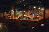
‘Not Being Nerds’: Harvard Students Dance to Tinashe at Yardfest

News
Wrongful Death Trial Against CAMHS Employee Over 2015 Student Suicide To Begin Tuesday

News
Cornel West, Harvard Affiliates Call for University to Divest from ‘Israeli Apartheid’ at Rally
It's Art--for the Sake of Art
"Informal Monumentality" Sets the Tone
The Arthur M. Sackler Museum, the latest addition to the architectural potpourri in the Quincy and Broadway Street area, has already caused ripples of both enthusiastic approval and emphatic disdain amongst avant-garde architectural critics.
It is an odd beast that inevitably draws attention. From the lime green railings to the Abu Simbel-like entry way to the porthole-like windows on the side of an expansive brick wall, it is not just a museum, it is an architect's work of art.
The creation of award-winning British architect James Stirling, the Sackler cost $9 million and took three years to build. It combines three levels of museum galleries with five levels of offices in a remarkably creative, exciting way.
The 60,000 square foot building adds 11,000 square feet of new gallery space to Harvard's museum system in a way few people ever imagined a campus dominated by Georgian architecture would.
Stirling called the overall effect "informal monumentality."
And not wishing to slight Stirling or the incredible time and energy that Harvard put into finding him, architectural reviewers have distinguished the Sackler with some extraordinarily favorable words.
"The building is remarkable for the creative virtuosity with which its functions are accommodated while suggesting a monumentality that belies actual dimensions," a recent issue of Time magazine quoted Ada Louise Huxtable.
"Stirling's facades offer a dramatic but deferential response to the Fogg's primary location and entry...Few buildings match the Sackler for sheer spectacle and power," wrote Gary Wolf who previewed the building for Architectural Review.
"[The Sackler is] the clearest, simplest and to my mind the best museum I have seen to date," said American architect Philip Johnson in a fall 1984 lecture, adding that Stirling, "had to contend with not enough money, not enough room, [and] with not enough space."
Nevertheless, one reviewer noted that Sackle's oddity could blind viewers to its qualities. "The Sackler's alternately amusing and infuriating clash of details may blind critics to its innovations," Time's architectural reviewer wrote.
And the Sackler may gain a few more oddities. The main facade of the Sackler on Broadway, features two enormous columns sporting bright green air-intake vents, which are designed to provide support for a proposed 150 foot sky gallery. If approved by the City of Cambridge, it will connect the Sackler to the Fogg.
Aside from the fact that no two rooms have the same dimensions, the Sackler has a few other oddities. Some of its current novelties include the museum's innovative entrance. Breaking with traditional museum architecture, Stirling designed an entrance where visitors descend to glass doors rather than walk up a grand series of steps. This reversal enables the third gallery level of the Sackler to reach the same height as the Fogg's second floor level.
If the sky bridge is completed between the third level of the Sackler and the second floor of the Fogg it will allow an even progression from the permanent, early Chinese and Buddhist art exhibits at the Sackler to related showings in the Fogg.
On the side, the Sackler's stripes of orange and grey brick echo the broad strips and curve in Memorial Hall.
What is, from the outside, a seemingly random placement of windows in the darker stripes of the facade, actually places the windows in the exact center of the rooms and offices along those sides of the museum.
Indeed, the Sackler seems to have been designed from the inside out. criticism tells its toll, the Sackler likely will not be viewed as one of his masterpieces.
"You don't tell Mr. Stirling how to design a building any more than you tell Picasso how to paint a painting," said President Derek C. Bok. But even Picasso had some bad days.
The first historical problem with the Sackler--a problem forced on Stirling--is its location, according to Floyd.
"The fundamentally sad thing is that the site would have better been where the Carpenter Center is. That is the initial tragedy," Floyd said.
"The second tragedy is that the Allston Burr Lecture Hall [which was torn down to make room for the Sackler] was an enormously important building. They demolished a fine piece of architecture," she said.
"In terms of campus planning it was a great tragedy," said Floyd. For at Harvard more than anywhere, campus planning means finding a great architect, giving him a proper site, giving him enough money, and hoping he comes up with something brilliant that also fits in.
The scene in which Stirling was to work was painted for him. And he was limited by not enough space and not enough money, said Philip Johnson, a noted American architect. So he dealt brilliantly with the interior of the building and poorly with the exterior, said Floyd.
"The spacial developments are brilliant. It's very beautiful on the interior," said Floyd.
Indeed by every account--positive or negative on other aspects--the Sackler's interior is a jewel.
The building serves as a museum and an office building. However, Stirling was asked to keep the two functions separate, so that the galleries could be climate controlled and the offices self controlled for economic reasons.
And in dealing with those two functions he created a Disneyland of rooms and galleries--constant surprises, wonderful colors, lovely offices--a magical mystery tour of an Indian, Chinese, Japanese and modern art collection.
And on the exterior?
"The exterior is a disaster, an absolute disaster. It's a very egocentric building," said Floyd. "The slick hard finished brick is purposefully a color that doesn't go well with Memorial Hall or the Fogg. Its machine made quality is the antithesis of the touchy, textural quality of Harvard buildings," said Floyd.
Floyd said the original pink and moss green brick colors Stirling wanted would have been a vast improvement.
Walsh said the University couldn't find pink and green bricks that would withstand the harsh Cambridge winters.
Stirling has drawn similar criticism for designing an excitingly vibrant entrance and a tremendously dull side and back.
"This slick finish, the bright green
Want to keep up with breaking news? Subscribe to our email newsletter.