News
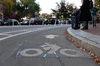
Cambridge Residents Slam Council Proposal to Delay Bike Lane Construction
News
‘Gender-Affirming Slay Fest’: Harvard College QSA Hosts Annual Queer Prom
News
‘Not Being Nerds’: Harvard Students Dance to Tinashe at Yardfest
News
Wrongful Death Trial Against CAMHS Employee Over 2015 Student Suicide To Begin Tuesday

News
Cornel West, Harvard Affiliates Call for University to Divest from ‘Israeli Apartheid’ at Rally
Harvard's Color Fields in the Forest
The most beautiful H's Harvard has ever seen are in cold storage, having faded from crimson to blue as a result of poor care and Rothko's kooky paints.
An anonymous door is slowly pushed aside to reveal a slightly colder atmosphere. The chill resides not only in the depressed temperature but also in the stasis of the objects, the artificial lighting. You are now inside the Fogg Art Museum cold storage facility. Located in the basement of the museum, cold storage is not only a repository for the leftover masterpieces of the Fogg's ever-burgeoning collection, but is also the surrogate home of Mark Rothko's mythical Harvard murals. Unlike its fellow occupants, the Rothko murals, wrapped twice over in heavy, light-blocking plastic, have emerged only two times for public view, once in 1988 and more recently in 1993, since their initial storage in 1979 in the Busch-Reisinger Museum.
But on this day, thanks to the generosity of the museum, over 500 square feet of canvas was allowed to shed its synthetic cocoon. For those unfamiliar with the enormous scale in which Rothko worked, this area refers not to the mural series as a whole, but rather only to a single panel, Panel #2 in this case. Three rectangles floating vertically in space connected at top and bottom by tensioned weights, Panel #2's chromatic range is now a pale blue denim rinse. Before its deterioration, the painting was of a fabled crimson complexion. Rothko's Harvard murals have been deemed "damaged goods" by the cynics, but more optimistic critics would use the term vita brevis, ars brevis, the aesthetic embodiment of the fragility and impermanence of art and life represented by art.
The story is sad but not hopeless. The culprit is more a fugitive red paint pigment that faded with exposure to sunlight than neglect by the infamous Harvard Corporation, the owners of the murals. It is a story easily sensationalized, and has readily been made into a pseudo-scandal, a skeleton in the university's closet. "Rothko had a very high, serious sense for the murals, which is partly a basis for problems that occurred later. I don't think that either side, Rothko or Harvard, had a full understanding of what to do with the murals. There was subliminal misunderstanding all around, but it was pretty subliminal," relates Marjorie B. Cohn, Curator of Prints, who was present to see the murals installed in early 1960s.
In 1960, Professor Wassily Leontief, head of the Harvard Society of Fellows, approached Rothko with a proposal to donate his artwork for the society's new meeting place, the penthouse of the Holyoke Center, to be designed by noted architect Jose Luis Sert, who also designed the Science Center and Peabody Terrace. Rothko, enamored with dreams of creating a public space with his artwork, was eager to bring this vision to fruition. Ideally, Rothko preferred that the viewer stand a mere 18 inches away from the surface of his paintings, so that his glowing canvases governed even peripheral vision. And still, what would be even more visually encompassing than to have a complete room walled by Rothkos?
Rothko's later paintings, half-jokingly described as "beach blankets", by Professor James Cuno, Director of the Harvard Art Museums, exhibit the potential for spiritual connotations. Indeed, there are as many possible interpretations of Rothko's artwork as there are opinions on the validity of modern art. But none is so evocative as the initial apprehension expressed by the Corporation about the Rothko commission. The walls of Harvard buildings, up to this point, had only been occupied by portrait after safe portrait of this or that Harvard luminary. At that time, the University was more a champion of contemporary architecture (Corbusier's Carpenter Center, Gropius's Graduate School dorm and Sert's eventual Holyoke Center) than a patron of modern visual art.
Skepticism was finally assuaged after then Harvard President Nathan Pusey '?? visited Rothko. A keen-minded Yale dropout, Rothko facilely picked up on Pusey's religious interests and proceeded to affix the Passion of Jesus to the murals--the darker ochres of Panels #1-3 (the triptych) were the colors of Good Friday and the Last Supper, while the brighter magenta pink of Panel #5 was representative of the Resurrection. Pusey, thoroughly impressed by Rothko's analysis and enthusiasm, advised the Corporation to vote for the murals' installment.
Cohn adds "I think it would be very limiting to interpret those murals as Rothko's depiction of the Passion. I never got the sense that that was his limit on their significance and I never got the sense that he wanted to put into words their explicit significance." After all, Rothko himself later pointed out that the murals' crimson backgrounds refer to the "spirit of Harvard," and the subject matter of the murals is a series of H's, contracting and expanding in rhythmic progression.
Indeed, the murals were passed to Harvard via a Deed of Gift that spanned five years, beginning on January 16, 1962. The University paid an estimated $10,000 for Rothko's material, travel, and transport expenses, and received what was appraised justifiably by the renowned artist as a series of paintings worth $186,000 in total.
The rest of the story plays out literally like an irreversible reaction. Rothko, who in addition to being radically innovative with subject matter, was also extremely experimental with media, haphazardly using a variety of unstable compounds such as egg whites and cheap Woolworth's paint. For the Harvard murals, Rothko mixed ultramarine, a stable blue pigment, with lithol red, a highly non-colorfast red hue, to yield the then crimson background. The murals' appearance today is the result of fading due to ultraviolet radiation that shone through the bay window of the penthouse. Furthermore, after the installation, the penthouse was turned into a well-frequented University dining facility. So, added to the damaging sunlight was beverage and food spills and splatters, vandalism, and even a physical tear from an ill-placed chair. The Fogg Museum, aware of the damage, made numerous attempts to bring about the murals' removal and preservation. But to no avail, as the murals belonged to the Corporation, which itself was held under the Deed of Gift not to move the murals without the artist's consent. Th final difficulty was Rothko's death in 1970, which lead to a legal entanglement over his estate that would delay the murals' removal for nine more years.
Which leads us back to the present: Standing in front of Panel #2, the only uncovered, respiring portion of the series, the other four hang frozen beside and behind it, shourded in plastic. Panel #2's current blue hues look somewhat dolorous. But Ms. Cohn offers assurance "that the ensemble as a whole still works" even if some unity is lost with the fading. "They still have the solemn resonance that Rothko wanted. A very inspiring ensemble still. Yes, they are damaged, but no, they are not wrecked."
Want to keep up with breaking news? Subscribe to our email newsletter.