News
Cambridge Residents Slam Council Proposal to Delay Bike Lane Construction
News
‘Gender-Affirming Slay Fest’: Harvard College QSA Hosts Annual Queer Prom
News
‘Not Being Nerds’: Harvard Students Dance to Tinashe at Yardfest

News
Wrongful Death Trial Against CAMHS Employee Over 2015 Student Suicide To Begin Tuesday

News
Cornel West, Harvard Affiliates Call for University to Divest from ‘Israeli Apartheid’ at Rally
The Changing Face of The Harvard Crimson
Below the minimalistic nameplate, a five-column layout of text is intermittently complemented by color photos. Bylines are printed in a different font from content, and articles are divided by thin dark lines. This is the front page of The Harvard Crimson with which current students are familiar—so much so that it is hard to imagine that the newspaper used to look otherwise. However, just a short 15 years ago, The Crimson looked drastically different, featuring black and white photos, longer stories on every page, and a marked absence of infoboxes and graphical features.
It is notable that The Crimson has changed so much during such a short portion of its 142-year history. Following the internet journalism revolution, The Crimson transitioned from a primarily physical publication into a multi-platform, digital-focused outlet spanning print, computers, and mobile devices.
FROM PAPER TO THECRIMSON.COM
1998 marked the birth of The Crimson’s website. Unsurprisingly, the design of the first version of the website looked both crude and lackluster by the standards of today’s aesthetics. The paper’s name—“thecrimson”—was displayed in lowercase Times New Roman font in the top left corner of the webpage, with a banner and a menu stretching right and down respectively, both in dark red. At any given time, there were typically on the front page fewer than seven entries, accompanied by two or three photos, some black and white—a layout that retained a lot of blank space within the browser page. In fact, a decent portion of the website was devoted to providing an alternative way to read the print newspaper online, exemplified by sections such as “In Today’s Paper” and “Daily Index”—the latter section directed readers to a comprehensive list of that day’s news articles, opinion pieces, and features. However, even in this early iteration, the website also included content tailored for the digital medium, with exclusive internet features such as “Breaking News” and “Web Specials.”
If the first online design of The Crimson could be considered crude by today’s standards, then the second version—launched in late 2001—could be called austere. In this iteration, news titles were still presented in Times New Roman font, but they were also marginalized to the default font size and the blue color used for hyperlinks. The website now more closely mimicked the stark layout of a traditional print newspaper with an extended length landing page that included many more stories—13 pieces were featured on the front page of the website on October 31, 2001. However, despite the increase in quantity of content on display, the decreased prominence of each piece potentially rendered the website as a whole less distinctive.
It was not until the redesign of late 2005 that the familiar aesthetic elements of today’s website began to appear. The most important drive behind this radical change was the increasingly dominant role of the internet in people’s daily lives—by this time, more than a seventh of the world’s population had gained access to the internet, up from just over 3 percent in 1998. Having a website became essential for any major news outlet, and there was as much, if not more, care put into creating an attractive and user-friendly design for the online version of The Crimson as for its print edition. By this time, the iconic elements of the current website—the banner featuring the newspaper name, the clear division of columns, and the crimson-colored news titles—were already present, albeit in a more primitive form. The website also looked much more similar to a modern news website than to an online version of a physical newspaper: The news entries were organized by topic rather than by their physical position in the paper, and there was almost no reference at all to the physical copy aside from a screenshot of that day’s front page. A 2009 touch-up further fine-tuned this design with the addition of sections featuring digital-only content from places like the new Flyby blog, as well as a “Most Read” section, which took advantage of the relatively new viewership and analytics features of websites.
RESPONSIVE WEB DESIGN
With the advent of the mobile web several years later, different priorities emerged for digital redesign. According to E. Benjamin Samuels ’13, president of The Crimson in 2012, the paper conscientiously focused its 2013 redesign on capturing non-desktop users. “The last Crimson redesign of the website had been a couple of years old, and what it didn't necessarily allow for was a good experience on tablets or smartphones, so there was a redesign that was done in large part with that focus in mind,” Samuels says. “It was becoming an increasingly—and I'm sure it still is—large chunk of the online readership. We wanted to make sure we were catering toward that appropriately.”
Given that an increasing percentage of visits had started originating from mobile devices and tablets, The Crimson’s digital focus shifted to accommodate these changes in viewership habits. “There were a couple different reasons we changed the website. Some were from a business perspective...but one of the big things we wanted to do was make the website responsive,” says Robert S. Samuels ’14, president of The Crimson in 2013 and the younger brother of E. Benjamin Samuels. “Meaning that if you view it on your phone, if you view it on your tablet, if you view it on your computer, the website will change to be optimized to the device you're using.”
The most recent website redesign was initiated during the tenure of the elder Samuels in 2012 and ultimately completed in 2013. “We had a couple of people who worked on tech, a couple people who were involved in design, and a couple specifically in online design,” E. Benjamin Samuels says. “There was an iterative back and forth process, trying to understand what we thought worked and what we thought didn’t.” One of these ideas was to create a rectangular block element on the website that was divided into segments for both pictures and text. “Eventually we whittled down from some of the broader ideas to more specific ones—ideas that we thought worked for desktop, for tablet, for smartphone. And ultimately, a year or so afterward, that was where the templates got implemented,” he says. Templates, now a major component of The Crimson’s publication process, systematized the process in a novel way.
This change paved the way toward data-driven design, especially because stories in the “Most Read” section were already prominently featured on the homepage of the website. “I wanted to make sure that [the redesign] was also something that would allow us to create more value for the advertisers of The Crimson, something that would help promote the stories we were writing,” E. Benjamin Samuels says.
Accompanying this key change were some backstage technical updates regarding the speed at which web pages were loaded. "There were also other business reasons that were more technical or tactical—the way pages and articles loaded and things like that,” Bobby Samuels says. “It was pretty well received and generated a lot of excitement. It just looked a lot more visually appealing after the redesign.”
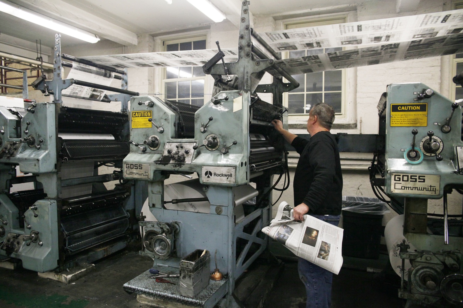
PRINT CONTENT
The most recent print redesign, implemented in the fall of 2014, came partly as a delayed response to the changes on the website. One critical development was the realization that the print newspaper would not and could not continue to contain all of the news that The Crimson ran. According to Samuel Y. Weinstock ’15, president of The Crimson at the time, the redesign aimed to be more prescriptive about the content that was published in print versus online. "The paper hadn't been redesigned for 10 years. It hadn't been redesigned since a time when we really didn't have a website with a strong presence. And it not only could use a more modern look, but it could use a leaner structure than it had previously, partly in recognition of the fact that the rest of our content was online,” Weinstock says.
Jake Freyer ’15, the daily design executive at the time, recalls a lengthy ongoing conversation over this matter. "Redesigning that paper had been something that had been an objective for a number of years,” he says. “The Design staff and a few successive generations of presidents and managing editors had decided they weren't crazy about the way it looked, and it seemed like most everybody had some little issue with it. So for at least three years before that, people had been trying to start [the conversation].”
Weinstock saw the print redesign as an editorial opportunity to focus the content of the print publication. "We wanted to start thinking about using the paper specifically to address our on-campus audience and what our on-campus audience would be most interested in, rather than just sort of a document that we would just throw all of our content into," he says. For instance, page two of the paper originally covered world news before being phased out. “That was something that sort of made sense in a time when people weren’t on the internet all the time, and people might actually pick up The Crimson in the morning and look on page two and see what had happened in the world the day before,” Weinstock says. “But obviously today no one is going to do that. No one picks up The Crimson to look for world news, because they’re on Twitter, on Facebook, they’re on the internet. And so what we did was we changed page two to the content that was specifically relevant to life on campus for that day, because the people picking up the paper were going to be people who were going to be living on campus that day. What are the events going on on campus? What’s being served in the dining hall?”
Even today, The Crimson’s Flyby Blog continues to provide daily updates on campus events and dining hall menus. It was important that The Crimson be a paper local to Harvard and local to Cambridge rather than a general newspaper. “The paper would be a tool specifically for someone picking it up in the morning rather than, again, this thing that we’d made as if anyone across the country might pick it up,” Weinstock adds.
PRINT DESIGN
However, many of the changes in the print redesign were focused not around the content of the paper, but rather around its physical design. “Many of the fundamental building blocks of the design were altered,” Freyer says. The paper had not undergone a print redesign since the switch to color in 2004, and its old-fashioned aesthetic was, to say the least, impractical. The lack of columns and inability to wrap text around images handicapped design; front pages in particular suffered. “The variation among different front page designs was minimal. We had fallen into a rut of just making the same design every day,” Freyer said.
The Crimson reached out to a local consultant named James M. de Vries, who is currently the creative director of the Harvard Business Review Group. “We got in touch with James, and he responded to the email within a few minutes, saying something to the effect of, ‘I’ve always thought The Crimson could use a shake-up,’” Freyer recalls. “What proceeded was about a seven-month process, including a summer vacation, where we did a lot of brainstorming. We did a lot of idea solicitation from different board members, different editors from every part of The Crimson to figure out what people liked and did not like and what they would like to see in a new design of the paper.” Throughout the lengthy process, editors at The Crimson, including Freyer and Weinstock, tapped into de Vries’s prior expertise in print publication design work in Australia. “They wanted to go through the exercise of doing the design themselves largely, with my advice and supervision,” de Vries says.
Fonts and typefaces were especially important to fix. “Everyone kind of had their own pet bugaboo,” Freyer says. “I really didn’t like ‘The Harvard Crimson’ font that appeared at the top of the paper. A number of people didn’t like our caption font. And the headline font was universally reviled, because it was really huge and wide, and no one could ever fit headlines onto the number of columns they wanted to.” Ultimately, the redesign settled on three “families” of fonts, and the new headline font ended up being more manageably sized. The nameplate at the top of the paper and the body text were assigned unique fonts, while the headline and captions were printed using different variations of the same font family.
“Within the newspaper, it’s always good to have a very strong, hard-working body typeface, which is the key reading typeface,” de Vries says. “And then you get a contrasting typeface, to be a sans serif typeface, for things like subheads and sidebars. You also want something that has a bit more of a personality for headlines.”
According to Freyer, this was not a decision that the design team reached easily. “We did a pretty extensive test of different options—the consultant provided a number of possibilities, including some of his own favorite fonts, and some that some designers he knew had designed. This ended up being one of the major expenses of the redesign because proprietary typefaces are rather expensive,” he says.
Throughout all of these changes, many aspects of The Crimson have remained the same. “The Crimson has a very strong tradition,” Weinstock says. “I think we and classes before us were in some ways a little more hesitant to radically change things like the way the name of the paper is printed, which is something that really hasn’t changed at all in many years.” The philosophy of the redesign was to stay as much as possible in touch with the tradition of The Crimson, while making the website look modern, sleek, and useful. That strong tradition cuts both ways, however.
Some changes were made under a high-minded ideal of deliberately affecting the content that the newspaper would produce. “We wanted a paper that was going to, in our minds endure a little, against the unarguable tide toward short attention span online news, as opposed to more thought out, longer-form journalism,” Freyer says. “There’s this irony with a student organization that even though no one is there for more than four years and everyone is constantly relearning how to do things, there’s an amazing amount of inertia. So people were nevertheless resistant to change. In the end, we’re quite happy with the way the paper looks, but our broader visions of how the content might change didn’t quite come through.” From print journalism to a hybrid that incorporates online content, The Crimson has been indelibly transformed in the past two decades. It remains to be seen just how far that tide will take it.
—Tianxing V. Lan and J. Thomas Westbrook can be reached at tianxing.lan@thecrimson.com and thomas.westbrook@thecrimson.com.
Want to keep up with breaking news? Subscribe to our email newsletter.