This is Not MY my.harvard
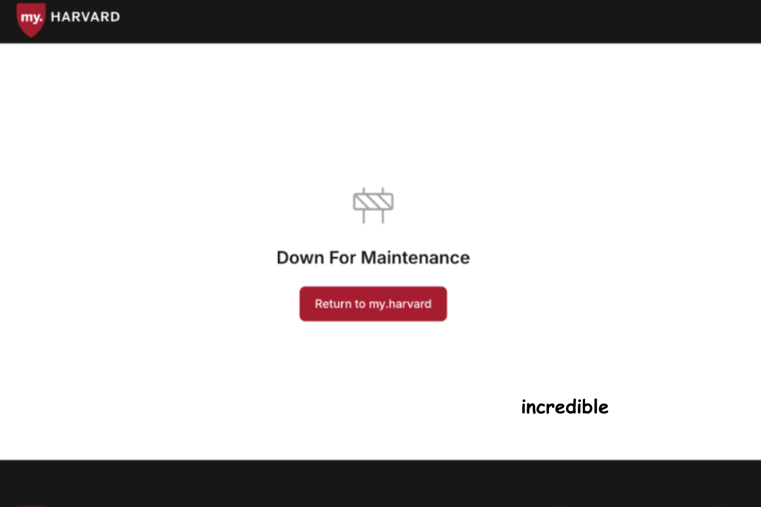
my.harvard sure looks different this year! The cleaner and more modern landing page is finally rid of its excessive hyperlinks and Excel-sheet aesthetic. But that’s not to say that it’s without its own shortcomings. From course registration kinks (like being dropped from sections randomly…) and pretty dubious coding, the new and improved website is not as much of an upgrade as it initially appeared. Funnily enough, while doing research for this piece, my.harvard crashed on me. What a weird twist of fate. With all of Harvard IT phone lines completely backed up, I was directed to a callback option. Thanks for the help, “Jamie” from Harvard IT. I would’ve loved to have had access restored 30 minutes before my TF assigned me to a section that entirely derails my GCal.
Course Registration
Old my.harvard was, for the most part, reliable. It met expectations. Slow and steady. It wasn’t flashy, never bothering anybody. It wasn’t cute or cool, but it wasn’t broken either. There’s a small chance it would lag the day that Add/Drop period began, but it’s common knowledge that all you had to do was be patient for 15 minutes, giving it time to gather itself. Kind of like a toddler.
Now look where we are. After seeing previews of the new my.harvard earlier this summer, I got nervous. I knew it was too good to be true—it felt too functional, if that makes sense. Even after planning to wake up at 5:30 a.m. on the first day of Add/Drop day to fire up the site, I knew I was getting myself into more than I bargained for. I was dealing with a beast I didn’t know how to tame, one that could legitimately wreck my perfectly plotted four years of classes.
One misstep meant your pre-med plan would go up in flames, all because that one class you had thought you would be a shoo-in for said sike and refused to let you register. Apparently, the “improvements” have been even more costly for students outside of the Harvard bubble. A cross-registrant in my economics lecture confided in me last week: “Nobody knows I’m in this class. The professor, TF, CA’s. I’m not even sure how I’ll get credit for it.”
About that Interface…
I might find it in me to give the functionality some grace if its aesthetic upgrade had been as showstopping as a short berryline line, but even that is missing the mark. All we got instead is a medium-weight typeface, minimalist emojis, and everything separated into clunky boxes. You can clearly tell that the front-end is vibe-coded. And this is not just coming from me. I’ve talked to many CS 50 pass/fail graduates, Stat 110 survivors, and Claude Pro users—true experts in the field. Their word is law.
Frankly, the website is also unnavigable. It’s gotten to the point where I spend more time on the website trying to find simple bits of information than I do finding the correct PDF to read for my tutorial. And if you’re anything like my dear friends, you might have even missed sections during your first week back because of how difficult it was to find your room assignments. Is it TBD or Sever 203 or Harvard Hall 101? I still do not know. A sincere thank you to the several degrees of separation (clicks) between the home page and my section assignments.
Am I Even in a Section?
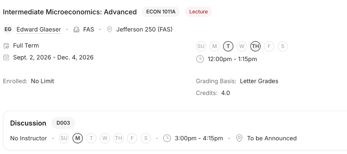
Our professors, the leading academics in the world, have so brilliantly designed their own system of keeping track of sections: embedded timetables in the most obscure page of your Canvas files. While nearly unreachable, it still beats whatever my.harvard has going on. The “00N” number of the section selections does nothing for us when they’re not even in chronological order. Friday from 3-4:15 PM takes 002, and Tuesday 9-10:15 takes 007. I have a serious bone to pick with whoever made every class have a TBD section option during registration, only for every section in the days after to still read as TBD. I guess now I at least have an excuse for skipping–oops, I mean missing–my section. Thanks my.harvard!
My Engineering Course is in the East Asian Languages Building
This may be a problem with how our TFs set up their pages, but I’d rather blame it on my.harvard. So, my.harvard, why is my section apparently taking place in several different locations on opposite sides of campus? Correct me if I’m wrong, but it doesn’t quite make sense that I would have to BlueBike from lecture to a section that is supposed to meet immediately after and nearby. Make it make sense.
Call me a luddite, but the new my.harvard is needlessly complicated. Several professors have published their own section times and locations because they’re tired of updating their courses. I’ve had to fill out copious Google Forms to re-section myself in a course, instead of being able to do so on my.harvard. My peers are complaining that their learning is impaired, and now I’m genuinely scared of spring course registration. Let’s hope that our administrators realize that their “technological advancements” are single-handedly responsible for my plummeting quality of life. my.harvard, I beg you, please go back to your old, flawed, but reliable ways. If it ain’t broke, why fix it?