
News
‘Deal with the Devil’: Harvard Medical School Faculty Grapple with Increased Industry Research Funding

News
As Dean Long’s Departure Looms, Harvard President Garber To Appoint Interim HGSE Dean

News
Harvard Students Rally in Solidarity with Pro-Palestine MIT Encampment Amid National Campus Turmoil

News
Attorneys Present Closing Arguments in Wrongful Death Trial Against CAMHS Employee

News
Harvard President Garber Declines To Rule Out Police Response To Campus Protests
Album Art’s Subtle Sidestep

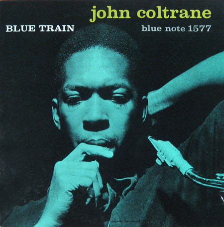
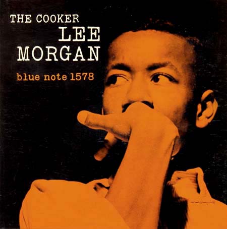
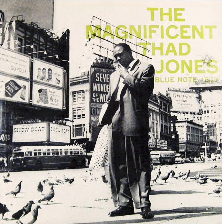
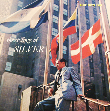
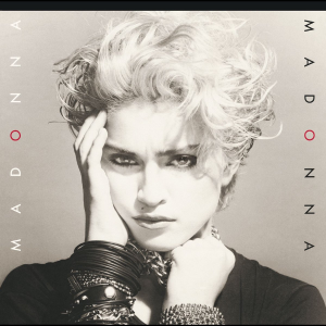
The album cover has carried cultural weight for a long time. Some of recorded music’s highest triumphs have been largely defined and identified in pop culture by the visuals that accompanied them: The unshakeable cool behind the album covers of Blue Note’s 1500 series helped spur a new generation of jazz innovators towards international stardom; The Beatles made a crosswalk one of London’s most famous landmarks with their cover for “Abbey Road”; Pink Floyd gave generations of stoners and dreamers a visual touchstone with the prism of “Dark Side of the Moon”; everyone from Phil Collins to Art Garfunkel to Madonna piped 12-by-12 inch images of their faces into millions of American homes on their LP sleeves.
Digital music’s rise to ubiquity at the beginning of the 21st century forced the meaning surrounding an album cover to evolve in subtle ways. An album’s cover art was no longer associated with the music itself in such a close, physical sense; freed from CDs and vinyl, music no longer depended so heavily on the jewel cases and LP sleeves plastered with art that had accompanied it for so long. While album art still traveled with music wherever it went, a small image in the corner of your iTunes window is obviously less attention-grabbing than a 12-inch sleeve or even a CD-sized insert.
Paralleling the physical relegation of album art, though, were a host of new, exciting opportunities for digitally transmitting visual information. The proliferation of the .jpg, .png, and .gif gave birth to a more democratic visual world—one that does not depend on a printer to spread an image. But it meant that the art accompanying albums had much more visual noise to fight through, especially on our computer screens. At the same time, that democratization gave album arts some new, thrilling avenues to travel. In the present decade especially, artists have started to take advantage of the digital proliferation of their album art to usher in a new era of interactive musical iconography.
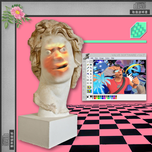
A demonstrative example of this phenomenon exists in the cult hit vaporwave album “Floral Shoppe,” released in 2011 by electronic artist Vektroid. Today, the album’s art is probably more famous than the music itself, largely due to its extreme affinity for endless, ridiculous, mad recreation and parody. While the visual chaos surrounding Vektroid’s album art at first looks like the meaningless product of teenagers with too much time on their hands, spend a little more time with it—and with the album—and you’ll see that’s just the point: The offhand sheen of vaporwave belies a deep nihilism. The genre, which almost indiscriminately mixes influences from all strata of popular culture, at its core probes the meaninglessness that comes with such a cacophonous clash of information. It’s a genre born of the internet, for internet-ridden minds. How does it feel to be confronted so constantly with such garishly meaningless stimuli? Listen to “Floral Shoppe” on loop while you scroll through your Facebook feed and you’ll begin to know. The album’s art, [with its ridiculous combination of statue, typeface, and color scheme, embodies this question and allows its meaning to grow with the internet age’s toughest questions.
Album art can weasel its way into our digital habits in a more offhanded way as well. California rap duo Death Grips, whose appeal is largely reliant on their internet infamy, released “Government Plates” in November of 2013, with an ostensibly simple cover: A California license plate with the word “DEATH” on it, photographed at a slight angle. As a physical album cover, the angle at which the plate sits doesn’t accomplish much, save giving the photo a little bit of physical depth. Played on an iPod Classic, though, the album cover accomplishes something uncanny: The iPod’s display format tilts the album cover just enough so the plate faces straight out of the screen. The iPod screen forces users to look “DEATH” in the face, while outside of an iPod, the album cover’s message angles slightly away. These newly participatory album covers both take from and give back to the internet culture from which they come; the art of “Government Plates” grabs a certain set of digital listeners in a unique way and pays homage to a true “classic”—the iPod that empowered a generation to carry an entire music library in their pockets.
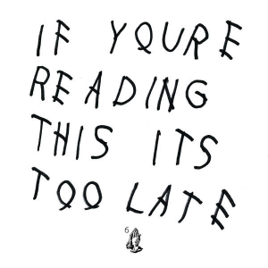
In 2015 album art’s formerly subtle digital forays began to enter the mainstream. Drake’s “If You’re Reading This It’s Too Late” art inspired a font that has led to countless parodies. The role that album art played in the publicity campaign behind Madonna’s “Rebel Heart” prompted outrage over racial insensitivity. Future’s “DS2” album art visually inspired a Robitussin commercial. While the physical presence of album covers retreats further and further away from us, their images creep quietly and subversively closer.
Want to keep up with breaking news? Subscribe to our email newsletter.