News
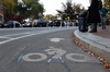
Cambridge Residents Slam Council Proposal to Delay Bike Lane Construction
News
‘Gender-Affirming Slay Fest’: Harvard College QSA Hosts Annual Queer Prom
News
‘Not Being Nerds’: Harvard Students Dance to Tinashe at Yardfest

News
Wrongful Death Trial Against CAMHS Employee Over 2015 Student Suicide To Begin Tuesday

News
Cornel West, Harvard Affiliates Call for University to Divest from ‘Israeli Apartheid’ at Rally
Communications Through Typography
at the Main Exhibition Hall of the Visual Arts Center
Visiting the big shows at the Carpenter Center is always a challenge, especially if you go early, before the brochures-that-explain-the-thing are printed and distributed. Of course, most of the works are visually exciting, but the current show of posters, pamphlets, advertisements, book jackets, stamps, and facades, and huge photomurals, railroad box cars, money, menus, and magazines, suggests a powerfully graphic argument about the role of typography in communications.
If I understand Albert Gregory's Communication Through Typography exhibition properly, the first point is that material utilizing typographic design is an inescapable part of our culture. Industrial society needs great quantities of such material for newspapers, travel posters, corporation reports and their ilk. The individual exhibits are purposely pedestrian. They are things we confront every day.
The second point, that there is an exciting and rich vocabulary of typographical images available, is dramatized by a huge photomural depicting the evolution of calligraphy and type and by the sheer voluminous variety of contemporary solutions to problems of textural and visual communication. From freely drawn Japanese calligraphy to highly formalized modern type face, the means of achieving typographical excellence are all too abundant.
How a particular designer solves his task, how he adopts the means available to the specific need of a problem, is the final point and main emphasis of the show. And it becomes quite apparent that Mr. Gregory considers appropriateness the key consideration. He wouldn't stop to argue with Dwight Macdonald about the poison of "kitsh"--what Macdonald calls the advertising non-art of middle class taste. Rather, Gregory suggests through his selections that there is a need for the highest standards of design in the content of communication as well as the world view of art.
What is "appropriate"? A cookbook of early Amerian recipes set in the Baskerville type of the colonial period is appropriate. The cover of a brochure for modern Knowles furniture which destroys our perception of the letter K and transforms it into a bending dynamic structure is appropriate. The NH symbol on a New Haven railway car, though it can be perceived in several ways (for example, with the figure-ground relationships of the letters changing), nevertheless strongly resists abstraction into its component parts. For a whizzing box car, that is appropriate.
The result of all this appropriateness should be the disappearance of merely "designy" products. What's corny should appear corny and what's serious should appear serious. When I looked at one display of a mightv locomotive dematerialized into a layercake of red and white stripes which visually couldn't make up its mind whether to pull the train or smash the cars behind it, I began to wonder how clear such standards are as yet.
On the whole, however, the executions are impressive. With samples of the work of A.M. Cassandre, Herbert Matter, and Paul Rand among the ingeniously hung exhibits, it is impossible to miss the wisdom and purpose of Mr. Gregory's exhibition.
Want to keep up with breaking news? Subscribe to our email newsletter.